感谢大家踊跃参与是次比赛,基金会收到众多作品,经评审团评审后,获奖者及作品如下︰
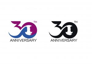
冠军︰Lin Hoi Kai
设计概念︰设计概念以红色为主调,蓝色衬托,融合为一个代表30周年的数字。现代男女概念渐模糊,进入无性别时代,两者人形「互为主体」融入如一个圆形,两个人形不分种族、年龄,象征人人生而平等,并无差别的意义,借此表达种族平等、两性平权概念。红色是象征愉快和幸福,蓝色也广泛用来象征冷静和责任,代表可靠和和平。因此设计用上了这两种颜色,让两种概念拼接,把两种对抗的气质融合。
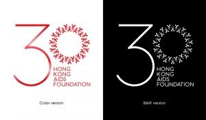
亚军︰Mark Ng
设计概念︰The most significant icon for AIDS is used in the design: Red ribbon. Both the 3 and 0 are ribbons. 3 with one single ribbon, and with 30 ribbons making up the number 0. This design choice is to tell the story that HKAF has gone through 30 years, from the first to the 30th.
The ribbons in 0 are pointing at all directions, meaning we accept all and stand by equality, and work in harmony, from both the inside and outside.
The outcome of this design also resulted in a wreath design, which is a symbol of respect. Main color choices are three reds, this also implies the HKAF cares for people in all colors.

季军︰Lau Yi
设计概念︰以圆形统计图作为基础,红蓝颜色各占一半(50%)并分别组成”30”这个数目字,当每一个半圆与另一半圆合成便会成为一个完整的圆形,就像每一个人在社会的地位都是均等,这才能组成一个完整的社会。

