Thank you for your enthusiastic participation in this competition. The Foundation has received numerous submissions. After being reviewed by the judging panel, we are pleased to announce the winning awardees and their pieces as follows:
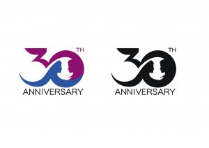
Champion: Lin Hoi Kai
設計概念︰設計概念以紅色為主調,藍色襯托,融合爲一個代表30週年的數字。現代男女概念漸模糊,進入無性別時代,兩者人形「互為主體」融入如一個圓形,兩個人形不分種族、年齡,象徵人人生而平等,並無差別的意義,藉此表達種族平等、兩性平權概念。紅色是象徵愉快和幸福,藍色也廣泛用來象徵冷靜和責任,代表可靠和和平。因此設計用上了這兩種顏色,讓兩種概念拼接,把兩種對抗的氣質融合。

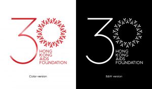
1st runner up: Mark Ng
設計概念︰The most significant icon for AIDS is used in the design: Red ribbon. Both the 3 and 0 are ribbons. 3 with one single ribbon, and with 30 ribbons making up the number 0. This design choice is to tell the story that HKAF has gone through 30 years, from the first to the 30th.
The ribbons in 0 are pointing at all directions, meaning we accept all and stand by equality, and work in harmony, from both the inside and outside.
The outcome of this design also resulted in a wreath design, which is a symbol of respect. Main color choices are three reds, this also implies the HKAF cares for people in all colors.

2nd runner up: Lau Yi
設計概念︰以圓形統計圖作為基礎,紅藍顏色各佔一半(50%)並分別組成”30”這個數目字,當每一個半圓與另一半圓合成便會成為一個完整的圓形,就像每一個人在社會的地位都是均等,這才能組成一個完整的社會。

